
Brief
I’ve selected Brief 5 (Made Natural) from the RSA pack — I really liked the cause behind it, and I think it’s so important to raise awareness about conserving nature.
The brief asks us to create a design proposal inspired by nature-based solutions and biomimicry to come up with nature-based solutions to solve environmental and social challenges.
Research
I spent some time doing research regarding issues in my local area and found my local council have started its first tree strategy: Coventry Urban Forestry Strategy 2022–2032.

There are lots of points around this and how the plan aims to improve various health-related factors, as well as the economy and system services.
I was thinking I could use this as a means to answer part of the brief and maybe create something that is educational and informative, because the strategy has been in place since 2022, but it’s not something I’ve known about till now, or seen any adverts or public information about it.
Outcomes
I planned to create some poster designs that raise awareness about Coventry’s Urban Forestry Strategy and show people a way they can help: joining council-led community planting sessions, volunteering with local park rangers, sponsoring a street tree, or becoming a volunteer tree-watering champion to ensure saplings survive their crucial first three years.


I quite enjoyed collagraph painting from a previous module, and I would have liked to use more natural materials, but plastic straws turned out quite well. I did try a branch, but the paint didn’t transfer well.
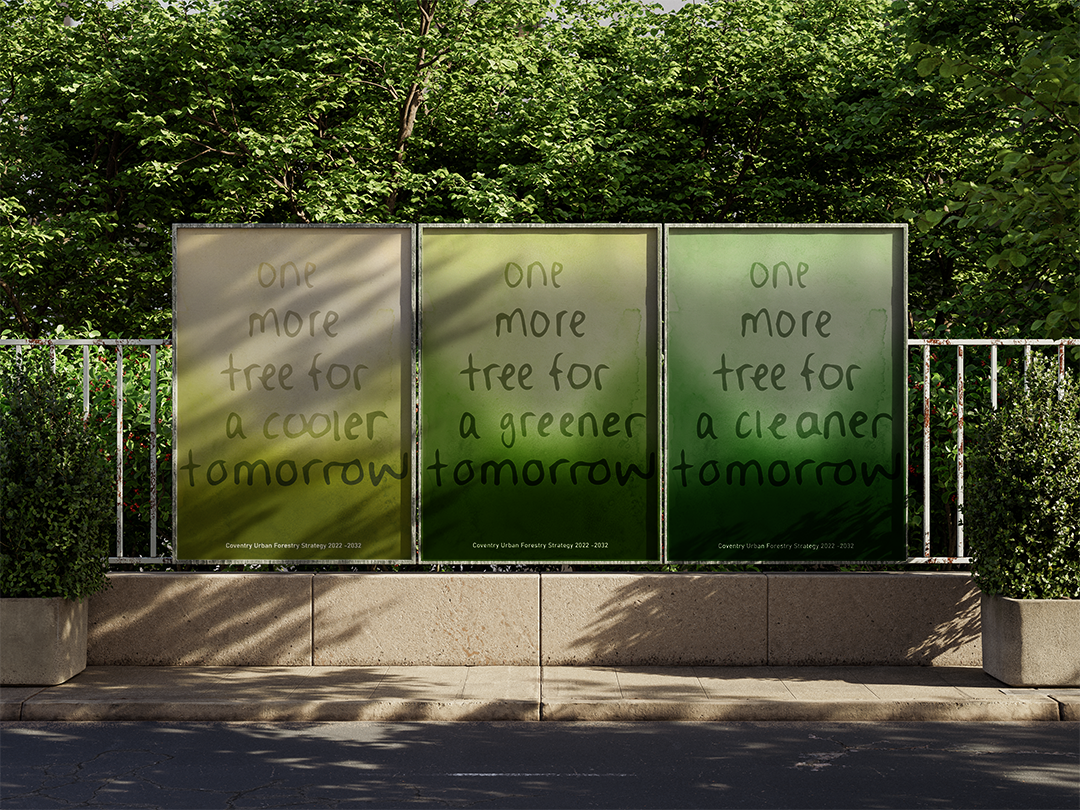
The audience I’m targeting is young adults/teens, so I’ve used some bright and bold colour combinations to stand out.


I also did some watercolour salt experiments to create an interesting gradient texture — I plan to have some text seeping into the background colours just enough to remain visible.
The next step would be to scan them in and develop digitally, but I’m aware of losing the tactile feel to these, especially as I have seen many of the AI-generated posters in my city, online and offline. I think keeping this traditional feel to the imagery will help stand out.


Using the watercolour/salt experiments, I started layering text to work with the gradient — I used quite a simple but child-like typeface to appeal to a younger audience and feel more connected.
Being a promotional material from the council, I was thinking of being more creative and informal and steer away from capital casing and neater letterforms to feel more approachable.
I was thinking about how the urban forestry strategy impacts other things and does more than just make the city green — so I came up with some more taglines to reference this.
I did try a darker shade of green, that’s a bit closer to a forest, but it felt too artificial. I think the lighter, muddier green fits the city better and doesn’t feel overly bright.
Feedback suggested I should move away from the connection to MAGA, and so I started thinking about other slogans.

My handwritten text feels much more natural and it links to the idea of being sustainable and using natural resources.
Mockups

I handwrote the text and tried to place it in a tree-like shape. The posters were originally all the same in colour tone, but side by side, they looked too similar, so I have adjusted the colouring slightly for variation.
It still needs a lot of refining, but I can see the design being applied to stickers and advert spaces. I think the tote bag application works quite well.


